Subscription dashboard for managers and store owners
2021
Company: Meu Crediário
Project type: SaaS Web
Launch date: January 2022
My role: Ideation, Wireframing, Prototyping, Handoff
Overview
This project presents how we improved the experience for managers and store owners who are Meu Crediário customers, making the information and possible actions regarding the subscription to the system more visible and easily accessible on any device.
I had help from colleagues from the Development team to answer questions I had about the complexity of developing the ideas I had throughout the process. I also talked to the Customer Support and Sales teams to collect suggestions and their impressions about the solution ideas.
Context
At the end of 2021, we were making some structural changes to the Meu Crediário software. The main objective was to make improvements to reduce rework and take advantage of the opportunity to implement a new billing model, creating a digital wallet in which the customer must recharge to continue using the system and have their services working, without limits, instead of fixed monthly plans.
Thus, the new structure was composed of separate modules for each system activity, which could also improve the users experience with the system, since each type of user (store employee) could access only the modules focused on their daily tasks, avoiding distractions and excess information on the interface.
The "Subscription module"
This module is the part of the system that is most used by store managers and owners (our clients) to view the balance of their stores with Meu Crediário, the statement of the services used (such as credit score analysis, for example), access invoices, manage users and, above all, recharge the store balance.
Up until August 2022, we had 1056 active paying customers (stores).
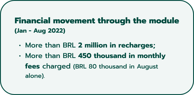
Data about the financial movement made through the Subscription module until August 2022, including more than BRL 2 million in recharges.
Our problem
Customers need to access several screens to access subscription information; when logging into the module, they see a screen that doesn't deliver value and without useful information.
User profile and context
Our users have a diverse demographic profile, as well as their familiarity with technology.
They are people from different states of Brazil, who manage stores of different sizes and diversified retail segments.
Thus, even day-to-day tasks and objectives may differ from user to user. However, we focus on improving the system based on our knowledge and feedback gained through managers and owners of large accounts, with whom we have more direct contact.
I try to design solutions and improvements carefully, thinking about presenting the interfaces in the most understandable way possible, with the intention that all users, regardless of their knowledge, can achieve their goals when using the system.
Our goal
How could we allow store owners and managers to easily see subscription status so they can act quickly and focus on their priority activities?
The solution
As a team, we knew that we wanted to make a beautiful home screen with a dashboard, because it would make the module more visually appealing and also useful to meet users’ needs.
We also knew that we had to create, at least, an MVP version of the module for smartphone devices. This was relevant because the manager or store owners are the ones responsible for recharging the store’s balance and it was important for us to allow them to do that from anywhere; they’re not always in front of a computer.
So I started by making a checklist of data and information that we should include on the dashboard.
Then, I made some sketches to start building my ideas and also to have something to show my colleagues in Customer Support and Sales and collect their suggestions.
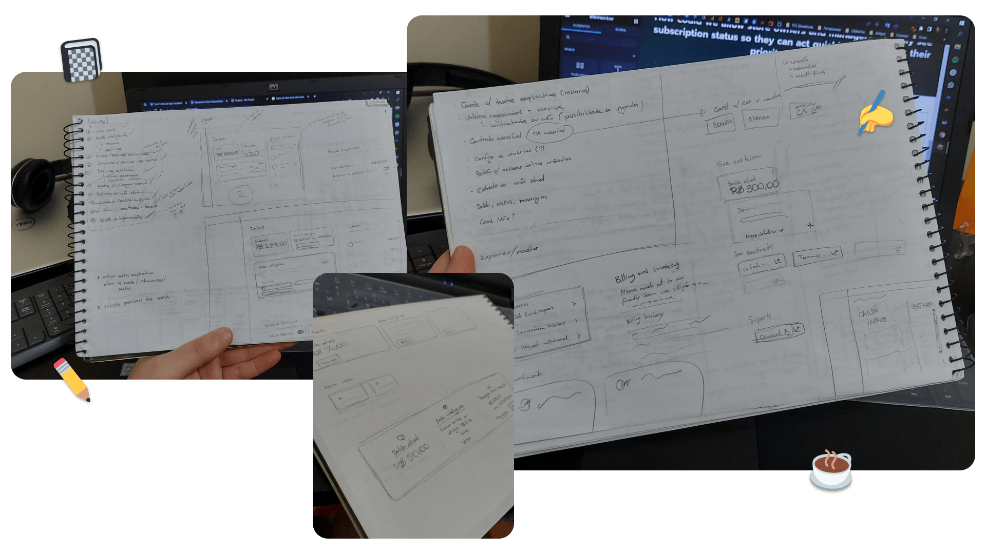
Sketches I made when I started designing the dashboard.
Our solution
Design a dashboard with useful and summarized information, with access to key module actions — such as topping up the balance — for desktop and mobile devices.
High fidelity prototype
I was really excited to design this initial dashboard, so I already had a lot of ideas for the final look in mind. I looked up for UI design references on the internet and started transferring the sketches I had done to Figma, starting wireframing.
With the wireframes, I spoke with the Customer Support and Sales teams to collect their impressions and verify if my design choices made the information clear enough.
Although they are not our users, through their experience and daily contact with users, we are always able to find several points for improvement and potential problems, just by talking to them. I always include them in my creations, especially when we don’t talk directly to our users.
Not long after that, I evolved the wireframes to high fidelity screens and started prototyping.
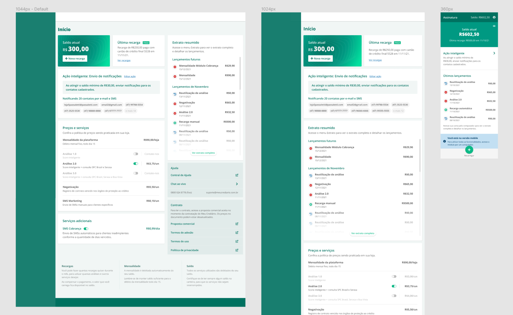
Screenshot of the Figma file showing the three screen sizes I prototiped the dashboard for.
For the mobile version, beyond the dashboard screen, we had to implement the funcionality of balance recharge, something that until that, was only possible by a desktop or tablet device.
To make the implementation simpler, we chose to transfer to the small mobile version only the indispensable elements: wallet statement, automatic recharge configuration and new recharge.
Handoff and development
Our team used a task manager tool (Linear app) where we documented the tasks to be developed. My handoff job consisted in creating the tasks with the description, working rules of the screen and all the necessary explanations so that the developer could easily understand the request.
Developing the entire dashboard was an activity considered big, so I divided it into small deliveries, so that the dashboard could be coded in parts.
That way, our customers wouldn’t have to wait for the dashboard to be complete to start enjoying it.
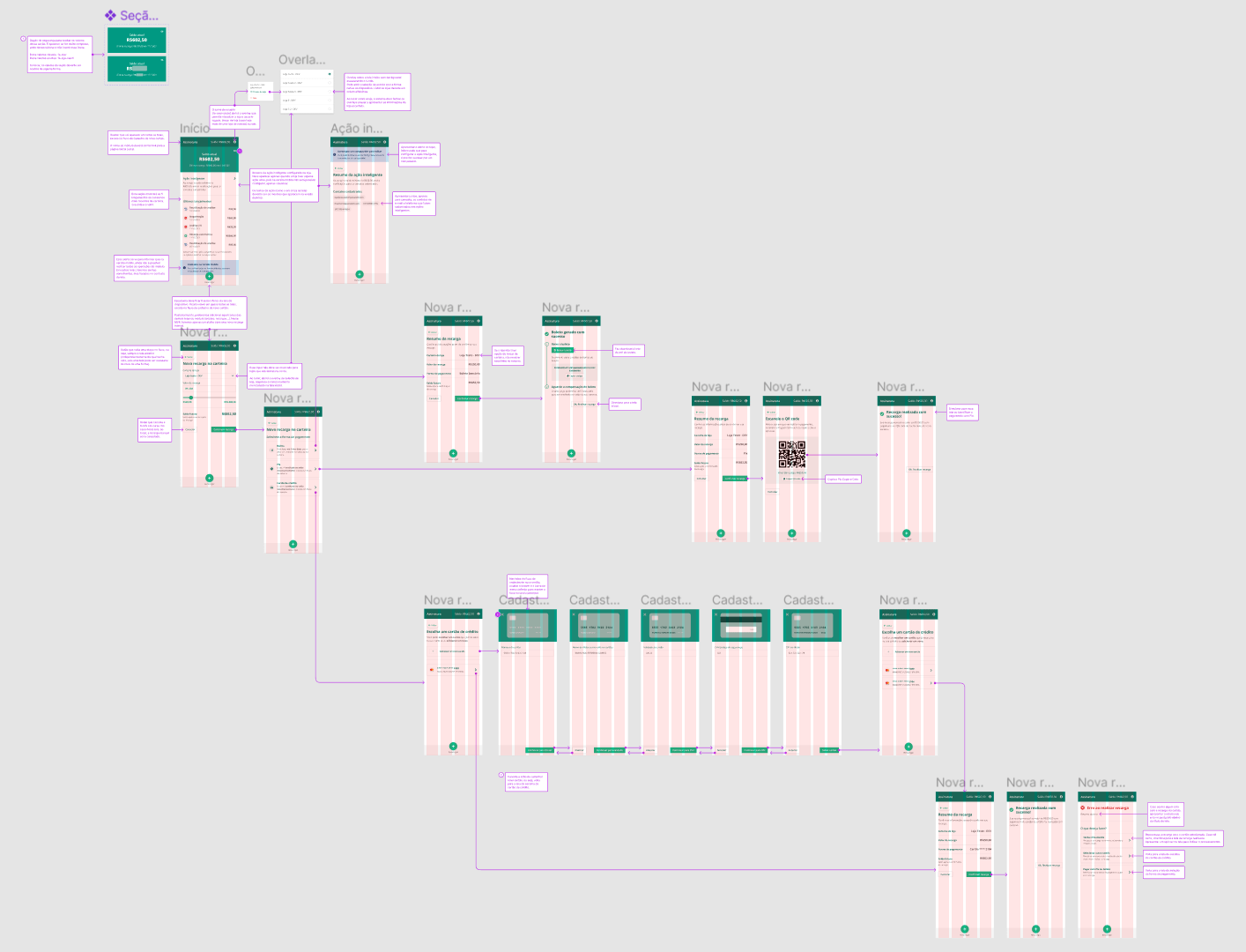
Screenshot of the Figma file showing the mobile version’s flow and handoff explanations.
Learnings and next steps
With this project, I was able to exercise, mainly, my UI design skills, as I had to design the dashboard in such a way that it was simple for the user to identify the current status of the subscription and what actions should be taken about it.
In addition, I adapted the main version of the dashboard to a simple screen for mobile devices, so that it was fast for the development team to apply the improvements and allow the user to utilize the features as soon as possible.
Although the main cards of the dashboard are already available, the card with the statement is still missing because the development team reported that we’ll have difficulties in presenting the statement with a good loading performance; on top of that, other priorities got ahead of this project.
